 |
|
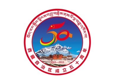
The commemorative logo for the 50th anniversary of the establishment of the Tibet autonomous region [Photo/Agencies] |
The basic pattern on the logo is a perfect circle, like a moving wheel. It symbolizes the trend of the prosperous development of the new socialist Tibet. The circle also symbolizes harmony and joy, showing the steadfast confidence of the people of all ethnic groups in Tibet toward building a moderately prosperous society and their longing for a happy life.
The logo uses elements from Mt. Qomolangma and the Potala Palace, giving it more identity. It also uses a combination of red, yellow and orange as well as the figures "1965-2015", all of which highlight the warm, auspicious and joyous theme.
The design element for the core of the logo is based on the Arabic numeral "50", highlighting the theme of the 50th anniversary of the establishment of Tibet Autonomous Region. Above the Arabic numeral "5" is the Five-Starred Red Flag (the national flag of the People's Republic of China), representing the close unity of the Tibetan people around the Party Central Committee with Xi Jinping as the General Secretary and everyone forging together as one. The bottom contains unique characteristic Tibetan colorful ribbons, symbolizing joy, peace and good fortune. The Arabic numeral "0" is combined with a fluttering hada(ceremonial white silk scarf) and lotus decorating the "5". This conveys a meaning of the substantial economic and social development and richness in the lives of Tibetan people.
A positive energy emanating from the logo design implies that, under the leadership of the Communist Party of China and in the socialist community, people of all ethnic groups in Tibet, full of pride and enthusiasm, are building a prosperous, harmonious, happy, law-abiding, culturally advanced and beautiful Tibet.
Related Stories