Magical, soaring structure serves to inspire
By Chen Hong (China Daily) Updated: 2018-01-23 07:45
|
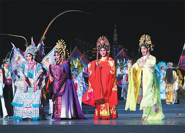
Artists perform Cantonese Opera in Guangzhou. |
As the old saying goes: there are a thousand Hamlets in a thousand people's eyes. But the Canton Tower is definitely one of the most-recognized iconic buildings in the eyes of Guangzhou's residents.
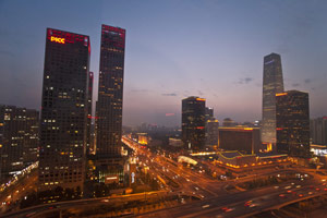
The 600-meter-tall Canton Tower, designed by Dutch architects and opened to the public in 2010, is the third-tallest tower in the world and the highest in China.
Shaped with a tube-like shell of vertical rods, the tower is radiant at night with its intricate and colorful lighting effects, making it an unforgettable evening feature of the Guangdong capital's dazzling skyline.
Besides its stunning looks, the tower has the world's tallest Mega Drop amusement ride and a sky wheel on its top and has been a major venue for the city's fashion shows, charity activities, artistic performances and innovative commercials.
That's why when Cao Xue, dean of the Visual Arts Design School at Guangzhou Academy of Fine Arts, started to design the new logo for Guangzhou, he picked the tower as the core part of his work despite the fact that Guangzhou has many more magnificent landmarks and brilliant cultural heritages worth considering.
As a cradle of China's Lingnan culture, Guangzhou has its Cantonese opera, music and cuisine renowned nationwide, and even worldwide especially among overseas Chinese.
Ancient buildings characteristic of Lingnan style in the city's different districts, and modern public facilities such as museum, library, opera house, concert hall in the city's up-market areas, well integrated, are equally tantalizing.
And the ocean of flowers almost everywhere in the city thanks to local residents' tradition to grow flowers is likewise symbolic.
"The tower has been an iconic symbol that can represent Guangzhou of our time and in the future," said Cao.
It is also the best image he came across to reflect Guangzhou's positioning as a smart city undergoing continuous development change - as the logo design required - Cao told China Daily.
"I used color to highlight the letter 'O' in the name Guangzhou, below the Canton Tower design in the logo, because the letter stands for 'Open' and 'Original.'
The elements are what have impressed me about the city and what I expect from the city," Cao noted.
Cao was a design teacher in Wuxi, in eastern Jiangsu province before moving to Guangzhou in 1999, where he accepted the invitation from a State-owned advertising company to be its creative director. "The Guangzhou people I met were nice, with a strong sense of purpose, and as long as you were competent, the locals gave you their admiration and obedience," he said.
"The longer I have lived in Guangzhou, the more it has charmed me because it's such an open and inclusive city, with a fusion of cultures that brings about creative ideas," Cao added.
"The city has nurtured and cultivated an environment where people with bold ideas can realize their dreams." After he became a teacher again in Guangzhou in 2006, Cao paid a great deal of attention to links between the arts and the city.
A graduation project for students in the visual arts design school at Guangzhou Academy of Fine Arts was themed "Design Guangzhou" for five years in a row, according to Cao.
The students were requested to put forward their creative ideas inspired by city life, which is "a way to better understand the city and better serve the city", he said.
"I hope the new logo can make promoting the city easier and will lead to more vivid stories about Guangzhou heard about and read about throughout the world," Cao added.
(China Daily 01/23/2018 page18)
- 'Cooperation is complementary'
- Worldwide manhunt nets 50th fugitive
- China-Japan meet seeks cooperation
- Agency ensuring natural gas supply
- Global manhunt sees China catch its 50th fugitive
- Call for 'Red Boat Spirit' a noble goal, official says
- China 'open to world' of foreign talent
- Free trade studies agreed on as Li meets with Canadian PM Trudeau
- Emojis on austerity rules from top anti-graft authority go viral
- Xi: All aboard internet express