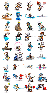
London Olympic logo boosts love for Chinese seal
Updated: 2007-06-07 18:19:59
By Cruz Fang (chinadaily.com.cn)
|
|||||||||||
When asked to make a comparison between London's and Beijing's logos, Zhou thought Beijing is more conservative while London is more outgoing, but Zhou chose London's as her favorite.
Although many Chinese have a chilly reaction to the vibrant London logo, Chinese graphic designers like it.
"It goes beyond the tradition - modern elements are emphasized instead of traditional culture," said Zhou Su, a 45-year-old designer.
"This helps the design to be accepted by people from different cultural backgrounds," Zhou explained. "The variation of the design for the Paralympics is a classic example for creativity."
For 35 year-old designer Xing Zhonghao, too many concepts might ruin a logo and this does not fall into that category.
"As a designer, I like this logo. It looks very relaxing and sporty," Xing said. "I think it's good for logo designs of sports events to break free from carrying too many meanings."
"Regardless of cultural backgrounds, I think people would choose this one [London logo] for being more relevant to sports games instead of Beijing's. "


Medal Count |
||||
| 1 | 46 | 29 | 29 | |
| 2 | 38 | 27 | 22 | |
| 3 | 29 | 17 | 19 | |
| 4 | 24 | 25 | 33 | |
| 5 | 13 | 8 | 7 | |
| 6 | 11 | 19 | 14 | |


Most Viewed

Gold medal moments
Age not a problem for Olympic dreams
Olympic moments to remember
Beijing Olympics just keeps on giving
Against the Olympic spirit
Olympic fashion tips
Taking success overseas
Competition Schedule